Plotly Express in Python: Concepts, Plots, and Quick Customizations You Need to Know
Making plots for an analytics dashboard? Doing EDA as the start of a ML project? Plotly is a go-to for creating quick, interactive and rather aesthetically pleasing visuals. Plotly Express (often referred to and imported as px) is a high-level wrapper to the Plotly module that provides just about all the main functions of Plotly, and is even easier to use.
This post will cover —
- Basic components of every Plotly figure and how to change them
- Essential plots for sample Product Usage Data Analysis
- Customization Code(sorting, stacking, overlaying, rotations, annotations, and more!) that will save you some trips to stackoverflow
*Full code and data used in this post can be found in this repo*
Part I. Basic components of every Plotly Figure
Whether it’s a simple line chart like the example below, or a 3-dimensional scatter plot with different color scales,
a Plotly Figure consists of ONLY THREE high-level attributes: 1) data, 2) layout and 3) frame, under the plotly.graph_objects.Figure class.
Keeping that in mind, we will go into more details and examples about data and layout. Frame is for animated plots only and not included in this post.
# Simple example line chart
fig = px.line(x= ['A', 'B', 'C', 'D','E'], y = [3,1,2,4,2],title='Simple line plot')
fig.show()Data Structure of every
Figure
In the simple line chart example, if you print out the figure, the output shows the data structure of this fig with data and layout —
print(fig)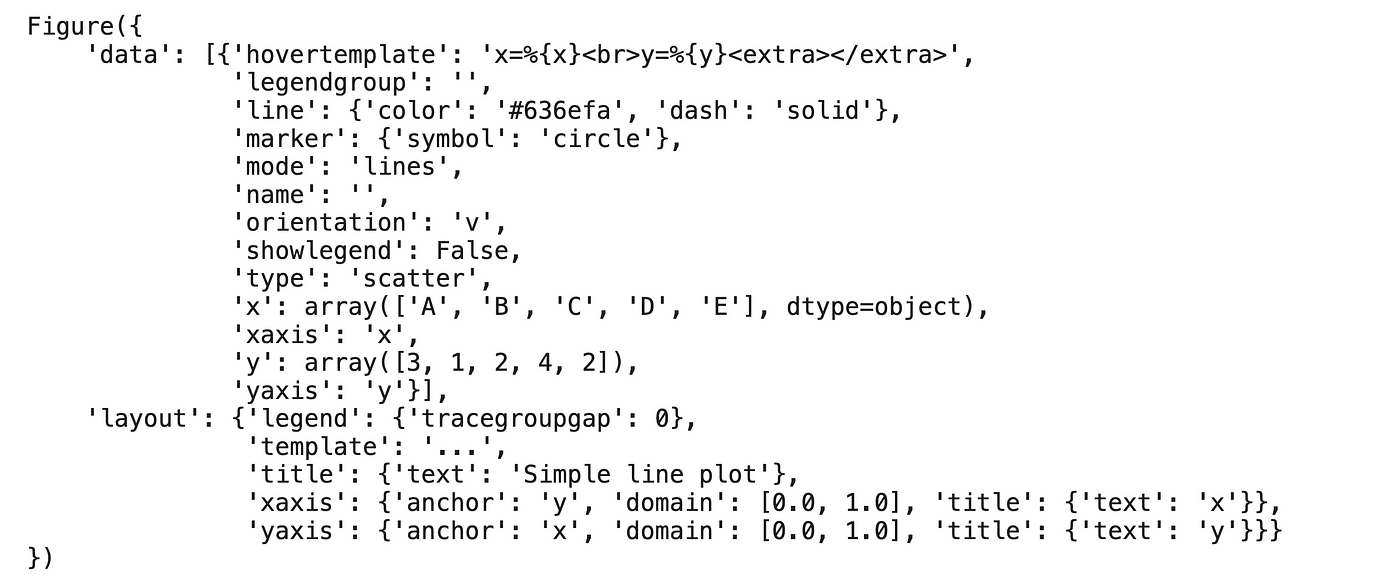
So, what are they and how to update them?
Attribute 1: Data
Data is a list of dicts each referred to as a trace. A trace is a single graph and must have a specific type (e.g. bar, line, scatter, etc.). All things related to a trace, e.g. hovers, marker, orientation, color of the lines and locations of data points, can be updated in this attribute.
In the simple line plot example, the blue line is the only trace and has type ‘line’, therefore data is a list with only one element. If there are n subplots in a figure, the plot will have n traces and data would be a list of length n, and you can update each trace individually.
Attribute 2: Layout
Layout is a list of dicts that controls the styling of the figure.
From axes, legend, title, to background colors, subplot spacing, everything NOT related to the traces is contained in this variable. Each figure, regardless of the number of traces (i.e. subplots), has just one layout variable.
Assign or Update Attributes
Attributes can be updated either like any other Python object attributes fig.layout.title.text='new title' OR simply with the underscore update method fig.update_layout(title='new title')
By now you should have a good grasp of how Plotly charts are constructed, so let’s get into the essential plots.
Part II. Useful Plots and Customizations
— for sample Product Usage Analysis
*Full code and data used in this post can be found in this repo*
In this example, we’re using some sample Product Usage data to showcase some most useful visualizations with different variations—
- Bars : Horizontal Bar Chart (Sorting), Stacked Bar Chart (add Rotations), Bullet Chart/Overlaying Multiple Bar Charts(add Subplots)
- Pies: Pie chart (add Labels, Legends), Donut Chart (add Annotations)
- Dots: Scatter Plot, Bubble Chart
- Trends: Area Chart (add Marker and Hovers)
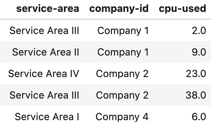
Let’s first take a quick look at the sample product usage data, and then go through each chart.
df.sample(10)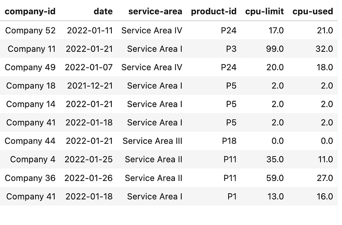
Each row is usage by company, date, product service area (each product belongs to one service area), product ID, CPU limit (entitled amount) and CPU used (actual usage).
Bars
Horizontal Bar Chart
Say we want to compare Number of Companies for each Service Area and have manipulated the original data df into df_count . Now let’s create a horizontal bar chart
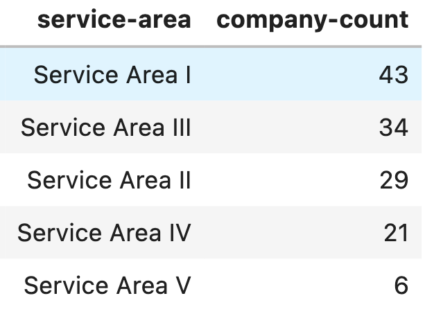
fig = px.bar(df_count,y='service-area',x='company-count', title = 'Horizontal Bar Chart', width=1000, height=700)and change name of the axes:
fig.update_xaxes(title='Comapny Count') # Change X axis title
fig.update_yaxes(title = None,autorange="reversed") # Reverse y axis order, Hide y axis title
fig.show()
Sorted Horizontal Bar Chart
To sort the bars based on Company Count, we simply sort the data frame and use df_count_sorted to create the same plot:
df_count_sorted =df_count.sort_values(by=['company-count'], ascending=False) # Sort Dataframe before plotingStacked Bar Chart (Rotated labels)
Stacking the bars gives more insights into usage composition. With some quick pandas groupbys we have this data frame df_stacked:
df_stackedfig = px.bar(df_stacked,x=’company-id’,y=’cpu-used’, color=’service-area’,title = ‘Stacked Bar Chart with roated ticklabel’, width=1000, height=700)and rotating the labels:
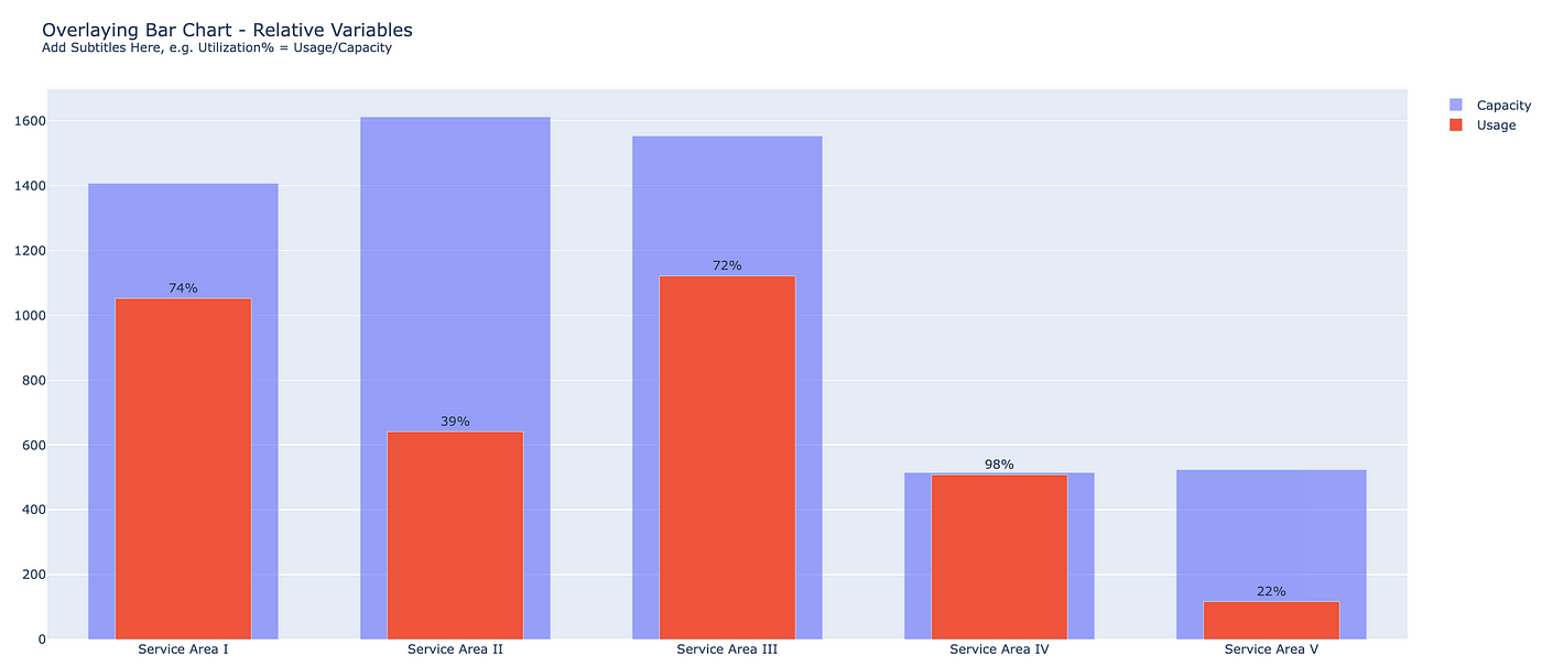
fig.update_xaxes(tickangle=-60)Bullet Chart/Overlaying Multiple Bar Chart (subplots)
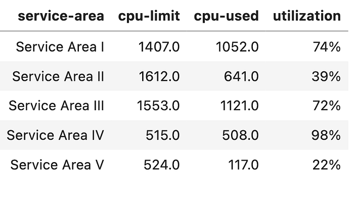
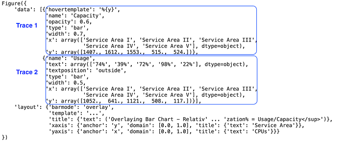
To show CPU utilization, we can overlay two bar charts by using plotly.subplots and adding two traces to the figure. Data frame to use after some engineering -df_agg
df_aggfrom plotly.subplots import make_subplots
fig = make_subplots(shared_yaxes=True, shared_xaxes=True)
fig.add_bar(x=df_agg['service-area'],y=df_agg['cpu-limit'],opacity=0.6,width=0.7,name='Capacity',hovertemplate='%{y}')
fig.add_bar(x=df_agg['service-area'],y=df_agg['cpu-used'],width=0.5,name='Usage',text=df_agg['utilization'],textposition='outside')The same code could be used to overlay more or different types of charts.
Also a quick way to add subtitles to the plot:
fig.update_layout(barmode='overlay', title= "Overlaying Bar Chart - Relative Variables<br><sup>Add Subtitles Here, e.g. Utilization% = Usage/Capacity</sup>",xaxis_title='Service Area', yaxis_title='CPUs')Here, if we print out the figure, you’ll see two traces with type bar under data and with overlay layout.
Pies
Pie Chart (labels, legends)
Using the same df_agg, we can create a pie chart
fig = px.pie(df_agg, values=df_agg['cpu-used'], names=df_agg['service-area'], title='Pie Chart with Percentges',width=800,height=800)Add some labels and hide legends to make the chart cleaner
fig.update_traces(textinfo='percent+label') # Add labels for each area
fig.update_layout(showlegend=False) # Hide legends
Donut chart (annotations)
Modify pie chart for donut chart, just add this line:
fig.update_traces(hole=.6) # modify for donut chartAdd some annotations in the center of the donut hole (x=0.5, y=0.5)
fig.update_layout(title = 'Donut Chart with Annotation',
annotations=[dict(text='Total Usage<br>3439 CPUs',x=0.5, y=0.5,showarrow=False)]) # Add annotationDots
Simple Scatter Plot
For scatter plot, we use df_scatter generated from the original df
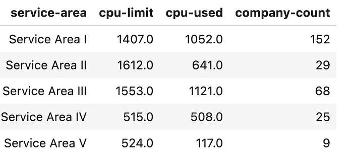
fig = px.scatter(df_scatter, y="cpu-used", x="company-count",
                     color='service-area',title = 'Scatter Plot',
                     hover_name='service-area')
Bubble Chart (add an additional dimension to scatter plots)
Bubble chart is a twist on scatter plot that visualizes 3 variables and their relative importance at the same time. By using x-axis, y-axis, and size of the bubble, we show three dimensions company-count , cpu-used , cpu-limit in data frame df_scatter
fig = px.scatter(df_scatter, y="cpu-used", x="company-count",
                     size='cpu-limit', size_max=60,
                     color='service-area',title = 'Bubble Chart - Visualize 3 Variables with X, Y and Bubble Size',
                     hover_name='service-area', width=1000,height=700)
Trends
Simple Area Chart
Comparable to line chart, area chart is a great way to show changes through time and adds volume for better visuals.
The data frame df_area has an additional week column generated from date
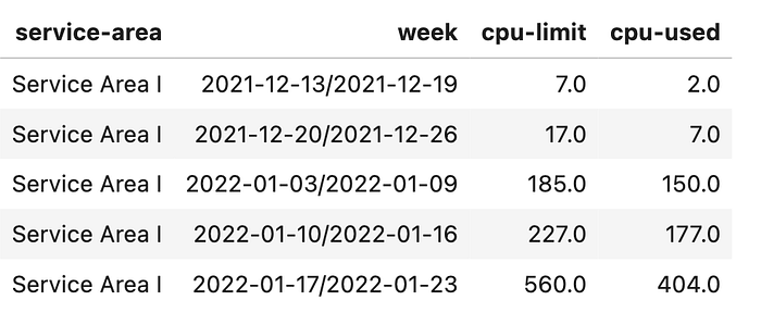
fig = px.area(df_area, x='week', y='cpu-used',color ='service-area', title = 'Area Chart - Changes through Time')Area Chart (Markers and Unified Hover)
For easier and more interactive value tracking, we can add dot markers and unified hover for x-axis. These two lines of code are also applicable for other types of plot.
fig.update_traces(mode="markers+lines") # Add markers
fig.update_layout(hovermode='x unified') # Add unified hover
And that’s it! Hopefully by now you have learned the basics of Plotly Express and find some helpful tips for easy customization.
References and useful links: